Title research: Twister
1. How many titles are displayed during the opening sequences to the film? Which ones?
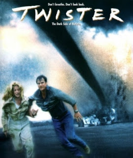
Twister only had 4 title cards. These included two being the production company (Warner Bros) and the specific production. The last title was the main film name, Twister. The last title card, the main name, appeared with each letter, not all at once. This is a cool editing style that went along with the background.
2. What connotations do the images carry? (how do you they make you feel)
The images make me feel a little scared. The also give the film a lot of suspense. The images weren't extremely descriptive towards the eye. It was wind/sand blowing around like a tornado. The words were put in place in front of the blowing winds. They overall make the movie more scarier and seem like it will have a good plot.
3. How is genre reinforced through symbolic and technical codes from the outset? (Can you tell what genre the film is)
You can tell the film will be a bit eerie and dramatic. You can see themes of thriller and action along with drama. Some drama films are a bit more scary and you can see that by the sequence. Being that the title sequence was quick, it showed its main highlights in the short period of time.
4. What conventions are used to ensure the film appeals to its target audience?
The clips in the background are moving and add a lot to the main idea of the film. The sound that was used was blowing noises to go with the windstorm visuals. There was also creepy sound affects of maybe a house creeping or moving. They also used big large lettering and fast editing to go along with the theme. These products all tied in that dramatic feel for the audience.


Comments
Post a Comment